Logo design / Label design / Web design
We’ve decided to play with typography in this logo design so it wasn’t a hard decision to take the word “krigl” ,which is translated to “the beer mug” , and literally give it a mug shape with foam on the top. It seems to be very catchy, laid-back and interesting for the customers.
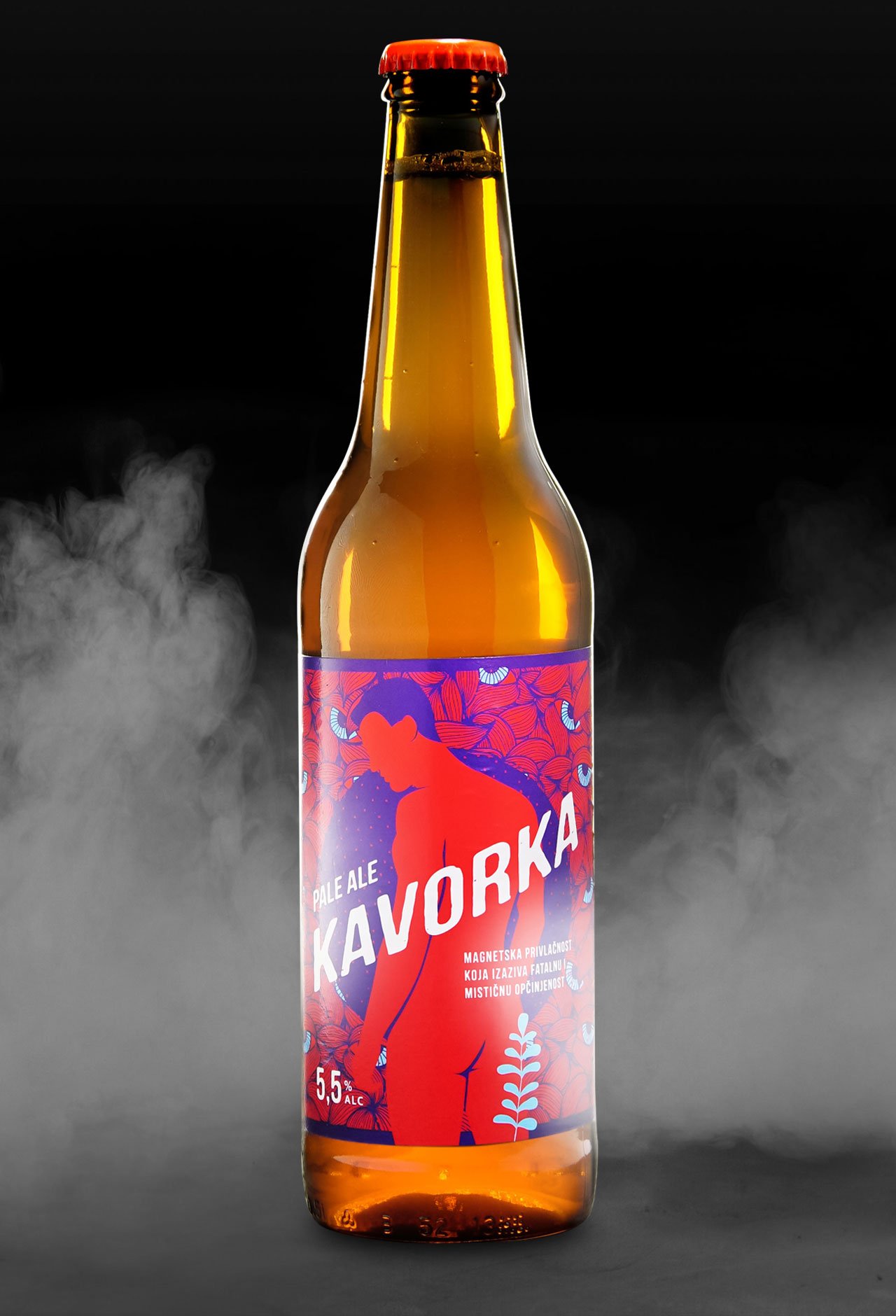
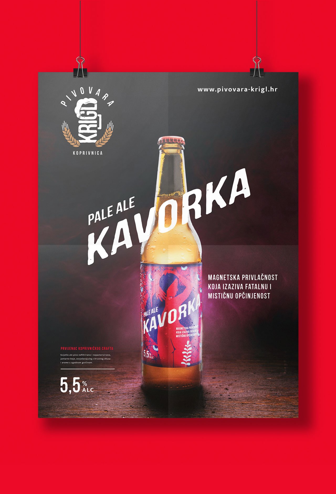
Kavorka literally means “the curse of attraction” and it was enough to inspire us to design two different labels which, put together, form a whole. They also work perfectly on their own in a mystical and a fatal way.