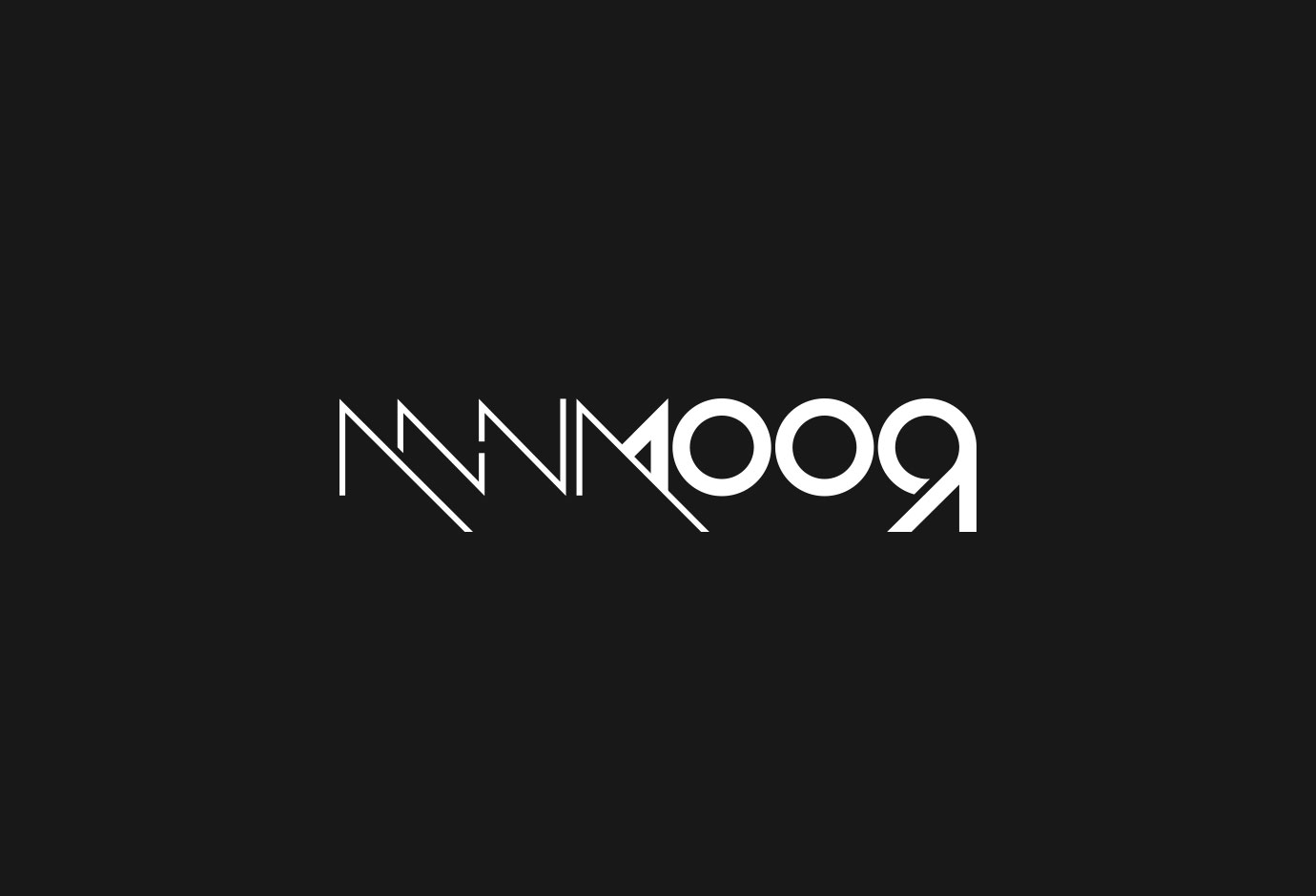
Logo design
Romana is a young and perspective singer and flute player, hidden behind the pseudonym Anna Moor. Her given and artistic names are actually mirror images. It gave us a lot of inspiration, but also challenged us to create an interesting logo where you can clearly see the game between the imaginative and the real world. The letter M is in the middle and we call it the point of reflection. Also, we’ve decided to use a prism as the symbol of the light refraction and combine it in some logotype variations.


